

Saturday 28 February 2015


Tuesday 24 February 2015
Contents Becoming Single Page
Monday 23 February 2015
Work To Do: 23rd February 2015 - 2nd March 2015
- Cover Inspiration - Oh Comely
- Contents Becoming A Single Page
- Contents Inspiration
- Double Page Spread Inspiration
- Page Numbering Inspiration - Dazed And Confused
- Flat Plan Of Cover
- Flat Plan Of Contents
- Flat Plan Of Double Page Spread
- Draft Pictures #3
- Draft Cover
- Draft Contents
- Draft Double Page Spread
Monday 9 February 2015


Wednesday 4 February 2015
Changing Age Range Of Target Audience
21 - 29
After looking at audience research, the audience that would read my magazine is most likely those between the age of 21 - 39, however, this is too vague and I feel the target audience needs to be more specific. Therefore I feel that this is an okay age range. My magazine still has the ability to get to those of older and younger ages and most likely would. For example, the magazine Q is for an older age range than myself. Though there are those in my age group that read Q.
Tuesday 3 February 2015
Teachers Constructive Critisism on Draft Magazine
Cover
- Look at Ratios, for example the hands are the same size as the head due to the fact they are closer to the camera. The way in which I will attempt to improve this is by taking individual photo's of the model and the picture in the cover. This will then be edited into the photo to make sure that the ratio's are realistic.
 Consider Interests, to do this I will use the diagram drawn to make the polaroid picture be in the centre, making it the centre of attention. Also, due to the fact that the polaroid picture takes up the face of my model, this means that the connection made with the reader via eye contact, has to be made through the polaroid picture.
- I also need to remove the barcode as my magazine is free.
- The text o the right although aligned, still looks out of place. Therefore I shall try other variations in placements, colour, size etc.

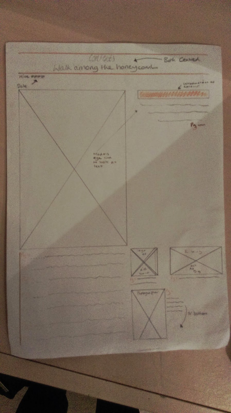
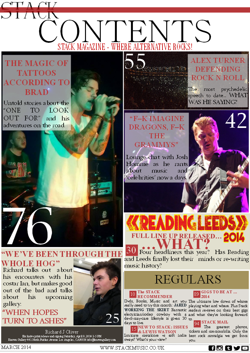
Contents

- The inclusion of other things, what I did on the two page spread, which I didn't on the others, is include the page numbers. Something else that I could add is something on the bottom border, such as the name of the magazine. This was inspired by Dazed & Confused and the fact that they do it in their magazine. Something they also do is put the page number next to it. This could be an idea as to what I do.
- Focus exclusively on music. Although the news that I included was music related and the politics I felt would relate to a left wing target audience, it draws attention away from the brief of being a music magazine.
- Also, the fact I have only used 5 numbers makes the magazine look unprofessional and makes the articles seem incomplete or just not there.
Two Page Spread

- Sort out the ratios of the picture. To do this I may change the picture itself or change sizing etc. on photoshop.
- I should also develop the titles font and keep the font used as only the covers masthead.
- The font of the "F" also must be changed to make sure that the title of the page and the letter work well together.
- The picture on the right is too dark. Therefore instead of using and black and white option, I shall lightly greyscale it to give the same effect. Just less dark.
- The text beginning with "In a small flat" is poorly laid out and is linguistically too flat. While being too close to the page centre.
- The body text: the spaces between the columns aren't equal in size. The margins aren't equal. The column on the right's text is bigger. It also is too narrow of a margin.
- The design is poor on the CD cover, with the text being too big.
- Also the text next to the CD cover is too big.
Subscribe to:
Posts (Atom)